In today’s fast-moving digital world, having a website is not enough. Your potential customers browse on mobile phones, tablets, laptops, and screens of all sizes. If your website does not adjust perfectly to every device, visitors leave instantly — and your competitors get the lead.
This is why Responsive Web Design has become more essential in 2025 than ever before. At KD Solutions, we understand that a responsive, fast, user-friendly, and conversion-focused website is one of the most powerful assets for any brand.
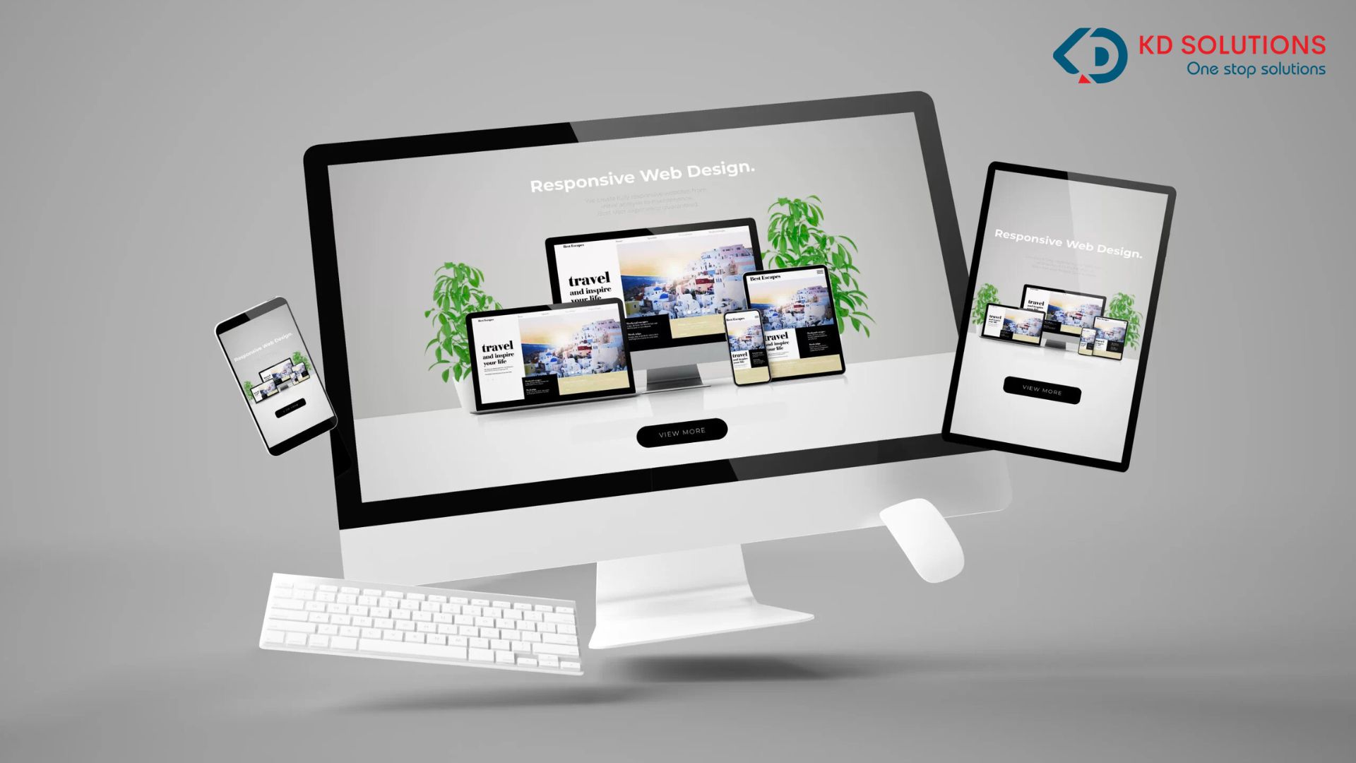
What Is Responsive Web Design?
Responsive Web Design (RWD) is a modern design approach that ensures your website adapts automatically to every screen size and device.
This means:
- Perfect mobile view
- Clean tablet layout
- Wide, professional desktop design
The goal is simple — give users a smooth, consistent experience no matter how they access your website.
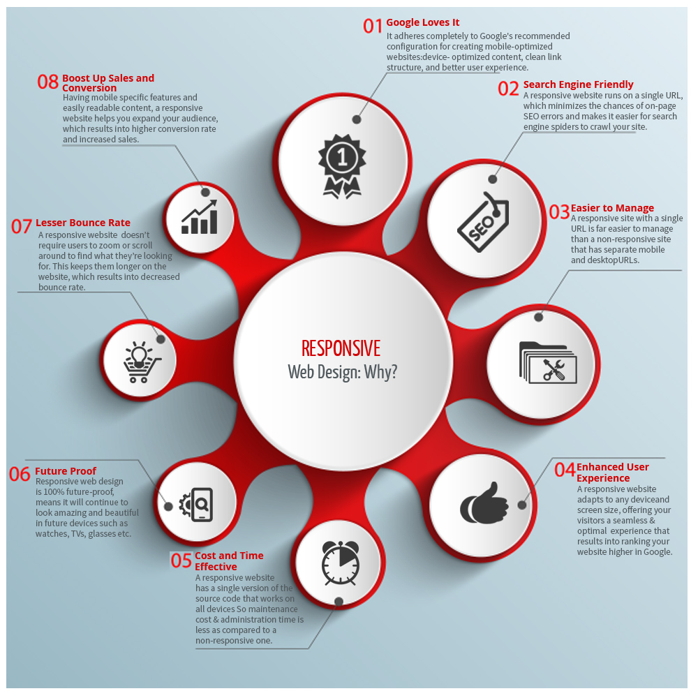
Why Responsive Web Design Matters in 2025 :
By 2025, more than 85% of global internet traffic will come from mobile users.
That means, if your website is not mobile-friendly:
- Your conversions will drop
- Customers will leave instantly
- Google will not rank your pages
Google already confirmed:
➡ Mobile-first indexing is the foundation of search ranking.
This makes responsive design not just a good choice — it’s necessary for online success.
How Responsive Web Design Boosts Conversions :
Here’s how RWD dramatically improves your conversions and business growth:
1. Faster Loading Speed = Higher Conversions :
Responsive websites are lightweight and optimized.
Just a 1-second delay can reduce your conversions by 20–30%.
With responsive design, page speed increases because of:
- Compressed images
- Clean code
- Mobile-first design
- Fast-loading layout
- CDN support
KD Solutions uses advanced speed-optimization techniques so your website loads instantly.
2. Enhanced User Experience (UX) :
Better UX = higher engagement = more conversions.
Responsive design ensures:
- Readable text
- Proper spacing
- Touch-friendly buttons
- Auto-fit images
- Smooth navigation
When visitors find your site easy to use, they naturally take action — whether filling a form, clicking a CTA, or making a purchase.
3. Lower Bounce Rate :
A non-responsive website looks broken on mobile. Visitors leave within seconds.
Responsive design prevents:
❌ Misaligned layout
❌ Cut-off content
❌ Scattered elements
Lower bounce rate =
✔ Higher rankings
✔ Higher conversions
✔ Better user trust
4. Higher Google Rankings :
Google prefers responsive websites.
Responsive sites improve:
✔ SEO
✔ User experience
✔ Core Web Vitals
✔ Mobile usability
When Google sees your website performing well, it pushes your pages higher in the search results — bringing in more traffic and leads.
5. Higher Trust and Credibility :
Navigation plays a major role in creating trust.
A responsive website provides:
✔ Clean menus
✔ Easy accessibility
✔ Smooth browsing
When users trust your site, they stay longer — and convert more often.
Key Responsive Web Design Trends for 2025 :
Here are the top trends shaping website design and conversions in 2025:
1. Mobile-First Web Design :
Designing for mobile first is now the standard.
This ensures:
✔ Fast performance
✔ Simplicity
✔ Clear structure
✔ High mobile conversions
KD Solutions follows a complete mobile-first strategy for all clients.
2. AI-Powered Personalized UI :
AI now adjusts website UI based on user behavior.
Examples:
- Personalized content
- Larger CTA buttons on mobile
- Simplified navigation
- Customized homepages
Personalized experiences can boost conversions by up to 60%.
3. Fluid Grids & Fluid Typography :
Instead of fixed sizes, responsive sites use fluid elements that adjust automatically to screens.
Benefits:
✔ Perfect readability
✔ Beautiful layouts
✔ Consistent experience
4. Minimalist User Interface (UI) :
2025’s biggest design rule: Less is more.
Minimal UI offers:
✔ Faster loading
✔ Cleaner look
✔ Better focus on CTAs
✔ Higher conversions
5. Voice-Friendly Responsive Design :
With voice search on the rise, responsive websites now support:
✔ Voice commands
✔ Micro-interactions
✔ Voice-friendly navigation
KD Solutions designs websites optimized for both SEO and voice search.
6. Dark Mode Compatibility :
Around 65% of mobile users prefer dark mode.
Modern responsive websites now auto-adjust to:
✔ dark mode
✔ light mode
This improves user comfort and engagement.
Responsive Design Is the Key to Growth in 2025 :
In 2025, responsive design is no longer optional — it’s a necessity for business growth.
A responsive website ensures:
✔ Strong SEO
✔ High conversions
✔ Better user experience
✔ Faster speed
✔ Higher customer trust
If you want your business to grow, attract more customers, and increase revenue, a high-quality responsive website is your strongest digital investment.
KD Solutions is ready to help you build a website that is:
- Modern
- Fast
- SEO-ready
- Conversion-focused
Your growth starts with the right website. We are here to build it for you.
Read More: Future of Digital Marketing: Key Trends Businesses Must Follow